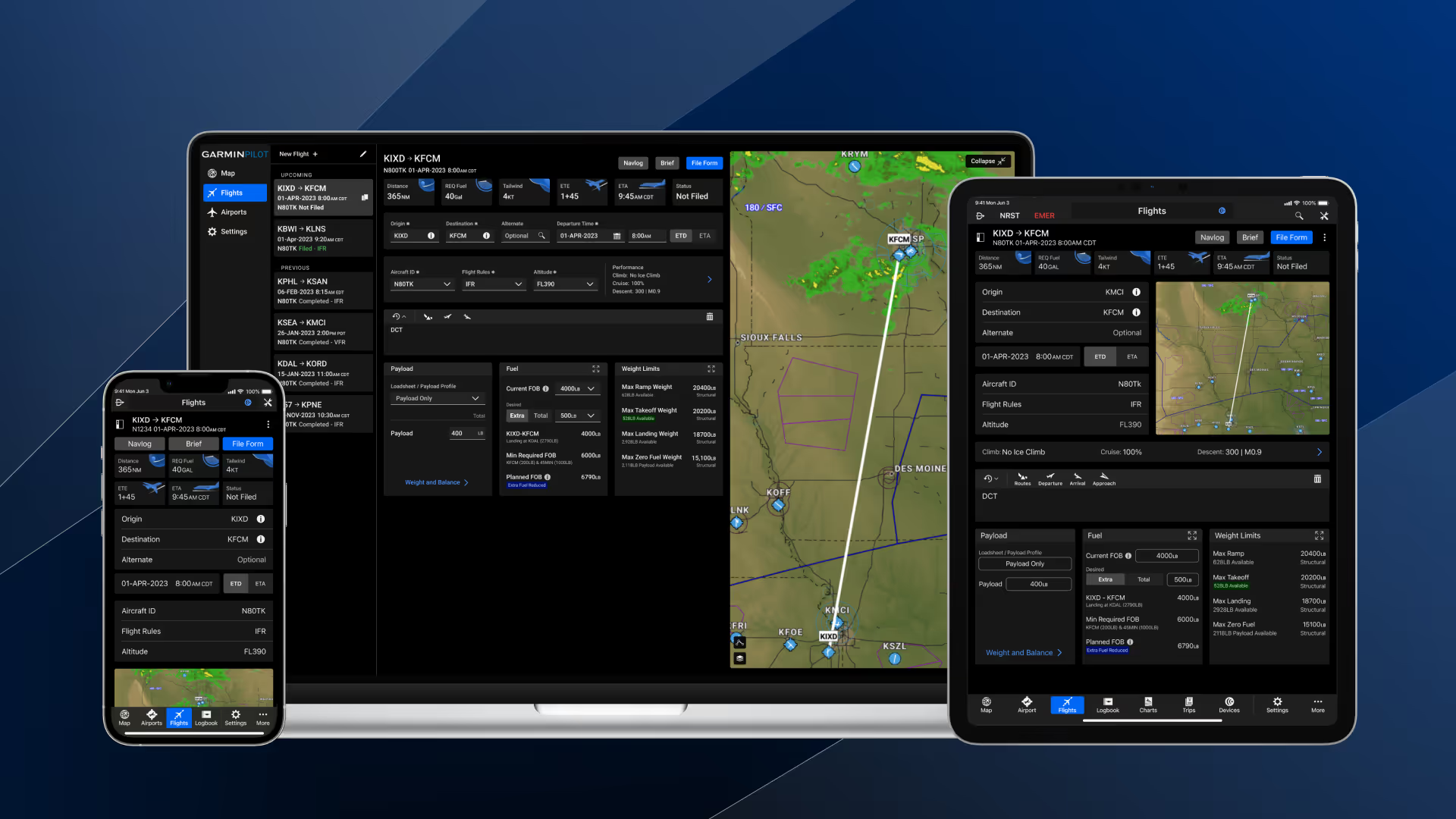
Andrew Rossi
There is no reason to say no to design systems.
Design System
Development
Web
Design-system and design tooling today is scattered across separate products, and the good ones are either piecemeal or paywalled. Solo designers, students, and especially open-source software maintainers lack a free, connected toolkit and a community to support design work.
UI Organized is a marketing site, a browser-based theme builder, a community space, and a set of Figma plugins. The theme builder pairs a color configurator, a typography configurator, and icon scaling and setup. The Figma plugins cover a color palette generator, an icon scaler, theme import, and data visualization, each one closing a gap between a designer's intent and a developer's implementation.
I sat down with three people whose work touches design systems from very different directions, a designer who would use the tools day to day, a manager who owns an enterprise design system, and a founder building a product on top of one. Each session ran the same way, a live walkthrough of the theme builder, the color palette generator, the icon scaling tool, and the Storybook inspection panel, followed by open discussion. I took notes throughout, and the problems that came up more than once became my fix list.
I walked Natty through the whole toolset, and the core mechanics held up, the color clamping that quietly steers a brand pick into an accessible range, the OKLCH palette controls, dark mode swapping across a full page through variables, stroke weight scaling with icon size, and the inspection panel showing class names and properties without a trip back into Figma. The problems were about structure. The tools felt disconnected, three capable things sitting next to each other with nothing telling a first-time user where to start, and the fix was hierarchy, lead with the theme builder and put a divider before everything else. Then a short accessibility list that stung a little given what I'm building, the contrast indicator itself failed contrast, placeholder text was too light, and a few disabled states were carrying required attributes they shouldn't have. Two gaps I already knew about came up too, icons don't update on theme import in Figma even though they work in code, and an unsupported font can break an import outright.
Michael came at it as someone who owns an enterprise design system, so most of the session was about scale and what comes next. The demo landed, especially the live Kanban board pulling straight from the GitHub project, which they liked for how much transparency it gives contributors, and the range of the theme builder running from color and typography through radius, spacing, and icons out to both code and Figma. From there it was mostly ideas for what to build next. A global settings panel for changing radius, fonts, spacing, and iconography at the project level, working the way agentic local tools do, change it locally, then branch and PR to apply it globally. Icon scaling folded into the inspection panel so stroke and size can be adjusted on the fly. Motion handled as its own token layer, with easing and tweens set from variables. The biggest one was retrofitting, pointing all of this at a system that already exists, importing its variables, editing them, and sending them back, closer to how Token Studio handles variable generation. That changes what the tool actually is, from something that builds you a system to something you can either build with or point at a system you already have, whether that's Material, Bootstrap, or something in-house. The best thing to come out of any of the three sessions came at the end of this one, an invitation to partner on the Versaterm Design System itself and hook UI Organized into it.
Noelle looked at it as a founder, so the conversation was about positioning and audience more than interface. The theme builder flow held up, brand colors picked inside accessible ranges, exported as JSON, previewed in Figma before applying, and synced back out. The more useful note was that Figma now exports a variable JSON schema on its own, which used to take a plugin like Token Studio, so Figma may be absorbing part of what my plugin does and I need to find out whether that export is enterprise-only. On the palette generator, not being able to edit swatches one at a time turned out to be the right call for the beginners I'm aiming at rather than something missing. The question I couldn't answer was what industry I'm building for. My instincts pull toward data-dense, table-heavy environments, which means advanced tables belong in a separate dependency instead of core, and components like chips and calendars change so much between industries that I need to write down their limits rather than pretend they work everywhere. The naming conversation was the one that stuck. AI tools read engineering-style token names more reliably than designer ones, and using a single set of names across Figma and code cuts down on mistakes when work moves between them, which makes AI-friendly design systems worth putting front and center. Code Connect came up as the way to embed code context directly into Figma components, which would also support the React-to-Figma plugin idea.
Order matters more than options. Every tool worked, but the set of them didn't explain itself. Three capable tools sitting side by side leave a first-time user with nowhere obvious to start, so the theme builder leads now and the rest sit behind a divider.
An accessibility tool has to clear its own bar. A contrast indicator that fails contrast undercuts the whole premise, and the same goes for placeholder text nobody can read and disabled inputs marked required. Those went to the top of the fix list.
Most teams already have a design system. Michael and Noelle got to the same place from different directions. Being able to bring in an existing set of variables, edit them, and send them back is what makes this something a team can adopt instead of something they'd have to start over for.
Name tokens the way engineers do. Engineering vocabulary reads more reliably to AI tools and to developers, and one set of names shared across Figma and code removes a whole category of mistakes.
Know the audience, then be honest about scope. Leaning data-dense means tables belong in a separate dependency, and components that shift a lot between industries, like chips and calendars, need their limits written down rather than hidden. The same goes for what doesn't work yet, icons not theming in Figma and fonts that can break an import.
Documentation is part of the product. The toolset is free, so tutorial videos are the main way people will learn it, and the honest version is that good videos make up for rough edges in the UX rather than excusing them.
The best feedback was someone wanting to use it. The most useful thing to come out of three sessions wasn't a good reaction to the demo, it was a working design system team asking to hook UI Organized into their own.
One shared rulebook of design tokens, read by every consumer, so customization happens in one place and flows everywhere.
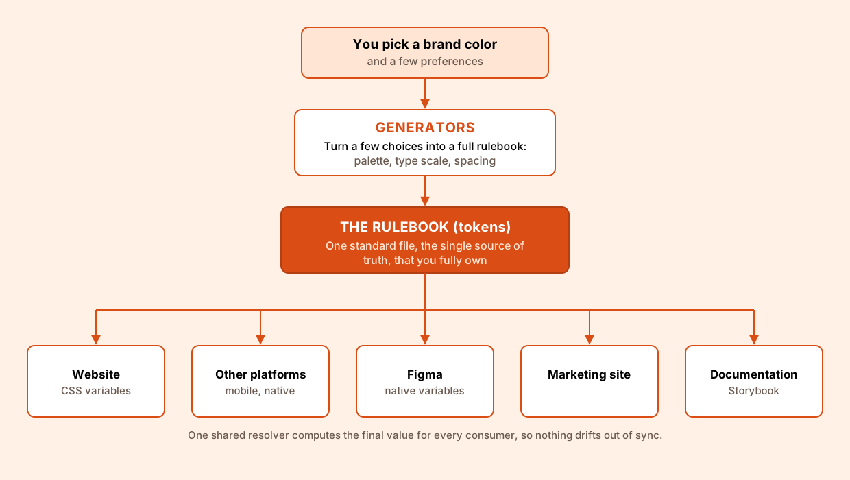
Because every layer reads from the same rulebook, customization happens in one place and flows everywhere. You can let the generators build a full system from a single brand color, or hand-author and import your own tokens and edit any value directly, since the output is plain, standard data with no lock-in. Themes, sub-brands, and light or dark modes are just different rulebooks, references resolve through one shared engine so nothing drifts, and the same tokens export to CSS, Figma, or any other platform. The result is deep customization at every level without ever trading away consistency.
UI Organized is the convergence of a few years of parallel threads: professional design-system work, a personal system built in Figma, and the plugins and tooling I built to connect design and code. Each phase added a layer, and the capstone is where they finally came together into a single connected pipeline running from Figma through Style Dictionary, React, and Storybook.
For three years I worked on design systems professionally, and alongside that work I researched and aggregated techniques from other mature systems and open resources. I studied how established systems like Material, Carbon, and Polaris structure their token layers, name their variables, and keep design and engineering aligned, and I collected the patterns that held up across all of them. The aim was to understand what makes a system stay consistent as it scales, and to map where the common tooling, often paywalled or piecemeal, still leaves gaps for a solo designer or a small team.
I spent about a year turning that research into a system of my own, authored in Figma as the single source of truth. I built out the primitive and semantic token layers there, covering color, typography, spacing, and radius, and structured them as Figma variables so that themes, sub-brands, and light or dark modes could all resolve from one shared foundation. Figma stayed the origin point for everything that followed: the token values, the component specs, and the visual language that the code would later mirror exactly.
When I started a new job I began building Figma plugins to close the gaps between design and development that kept slowing handoffs down. The plugins move design tokens between Figma variables and standard DTCG files in both directions, so a value defined by a designer stays correct by the time it reaches a developer, and a change made in code can flow back into the design source without anyone re-entering it by hand. Building them showed me the exact seams where design and engineering fall out of sync, and those seams became the problems the rest of the system set out to solve.
The capstone is where the threads converged into one pipeline. Figma remains the source of truth for the tokens. Style Dictionary takes those tokens as standard DTCG input and compiles them into CSS custom properties and typed exports, keeping references intact so that a theme or mode swap cascades cleanly instead of drifting. A React component library consumes the generated variables, so every component reads its color, type, and spacing from the same tokens rather than hard-coded values, and Storybook documents the full set with live, interactive examples and built-in accessibility and theme checks. With the plugins keeping the Figma source and the code in sync on both sides, years of research, a Figma system, and a handful of tools finally became one connected workflow where a change at any layer flows through the rest without falling out of alignment.

Figma

React

Style Dictionary

Storybook
The connected pieces that make up UI Organized: a marketing site, an open-source community workflow, living documentation, a component library published to npm, a color generator with a companion Figma plugin, theming with import and export, and dynamic icon scaling.
The public front door, a marketing site that explains the system and routes people to the theme builder, the component library, the documentation, and the community.

UI Organized is free and open source, not a paywalled product with a thin free tier. The whole thing, the theme builder, the Figma plugins, and the token engine, is built in the open and self-hostable, so you own your data and never depend on a vendor's cloud. Contribution is open to both sides of the craft: designers can shape the presets, the Figma workflows, and the documentation, while developers can extend the generators, the resolver, and the platform exports. The harder and more interesting goal is designing for contributors and not just users, since an open-source project lives or dies on its contribution workflows, onboarding, and docs.
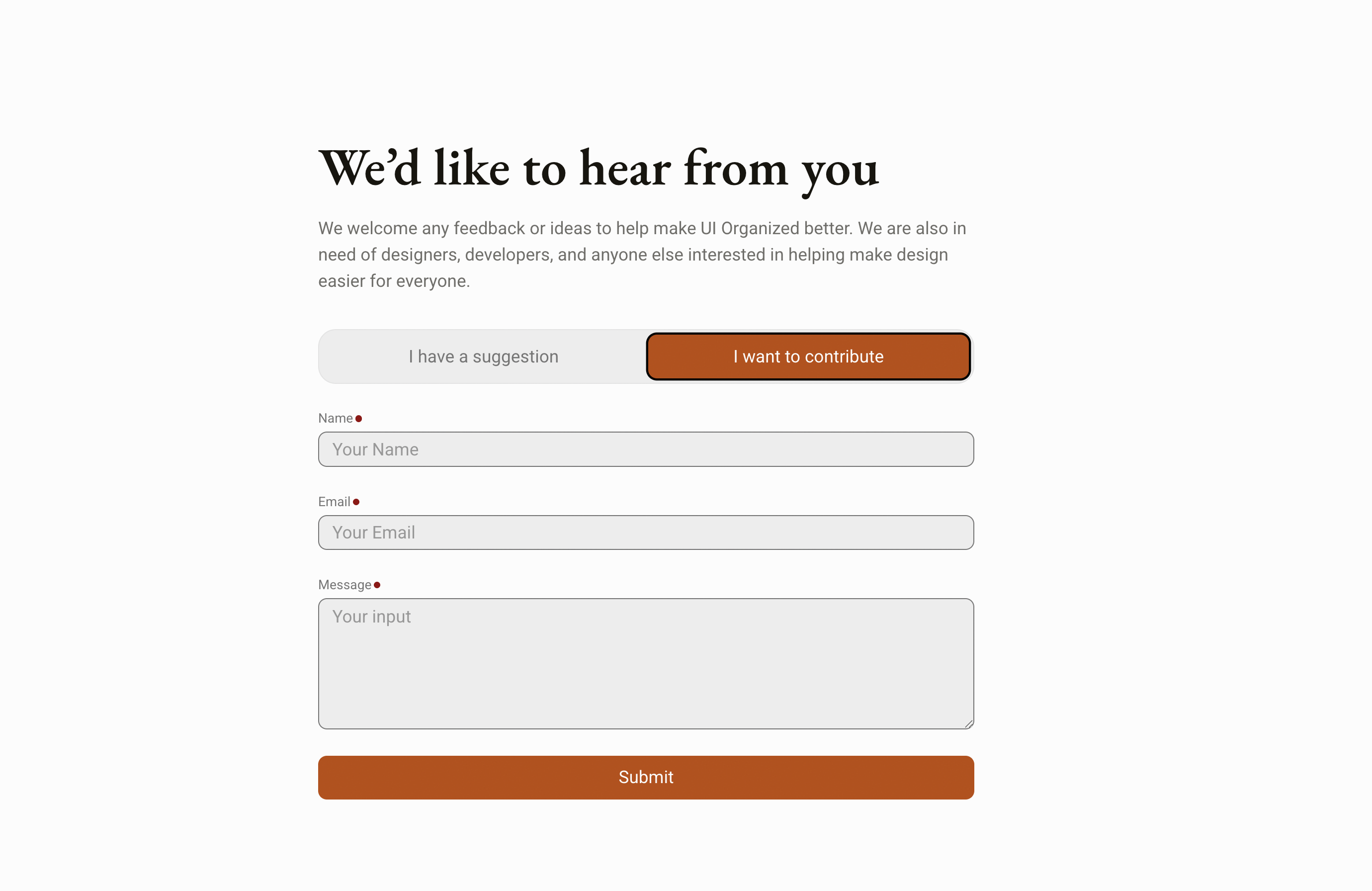
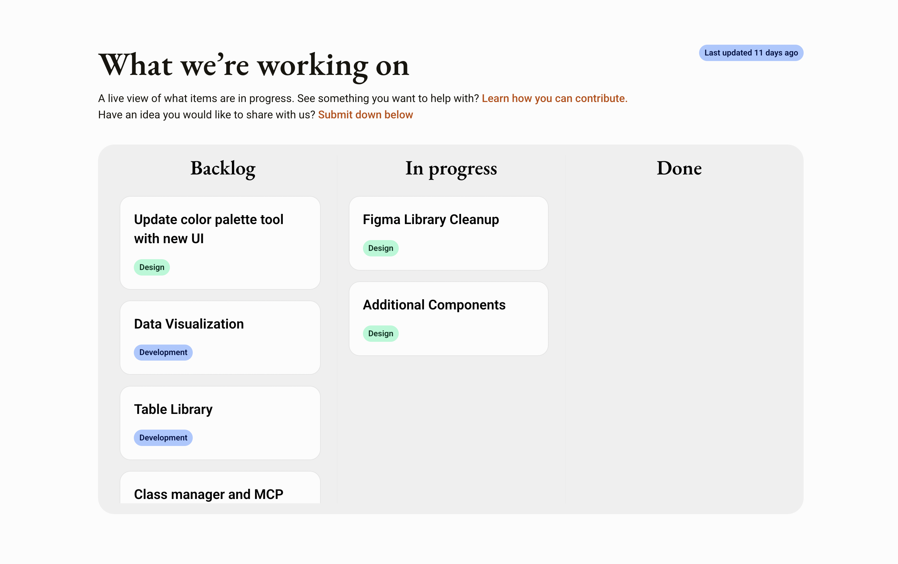
Anyone can pitch an idea straight from the site through a contribute form. Each submission is filed automatically as an entry on the project's GitHub board, and once work actually starts on an idea, the site's progress dashboard updates on its own to reflect it. That keeps the roadmap transparent, shows contributors where their idea stands, and makes the project's momentum and impact visible to everyone.
The published documentation reads from the same single source of truth as the website, Figma, and every other consumer, so the docs can't drift out of sync with what actually ships.

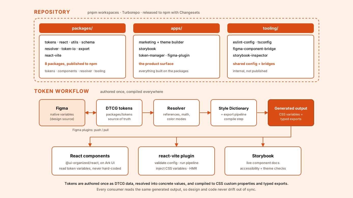
The component library is not a mockup, it is real, open-source code that anyone can install. Everything ships from a single pnpm and Turborepo monorepo and is published to npm under the @ui-organized scope, so a developer can pull the tokens, the components, and the build tooling straight into their own project. The packages are versioned and released together with Changesets, which keeps the token layer, the utilities, and the React components in lockstep as the system evolves.
The repo is organized into a few clear areas. packages/ holds the published libraries that make up the system. apps/ holds the things built on top of them: the marketing site and browser-based theme builder, the Storybook, and the Figma plugins. tooling/ holds the shared configuration and connective tissue, including the ESLint and TypeScript configs and the Storybook inspector. Turborepo runs the build, dev, test, lint, and typecheck tasks across all of them from one place.
The published packages split responsibilities cleanly. @ui-organized/tokens is the design-token layer, shipping both typed exports and the CSS custom properties generated by Style Dictionary. @ui-organized/react is the component library itself, built on Ark UI so the components are accessible and unstyled by default, then themed entirely from the token variables. @ui-organized/utils handles color generation, the type scale, spacing, and semantic-token resolution, while @ui-organized/schema defines the Zod schemas and TypeScript types that validate a theme configuration. Underneath, @ui-organized/resolver is the deterministic engine that resolves token references, math, and color modes, and @ui-organized/token-io and @ui-organized/export handle reading, writing, and compiling tokens across formats like DTCG and Tokens Studio.
Those packages work together as a pipeline. Tokens are authored as standard DTCG data, the resolver flattens references and modes into concrete values, and the export step compiles them into CSS custom properties and typed exports. The React components read only from those generated variables, never from hard-coded values, so a single theme change updates every component at once. For consuming apps, the @ui-organized/react-vite plugin validates the theme configuration, runs the whole token pipeline, and injects the resulting CSS variables at build time and live during development with hot-module reload, and Storybook documents the finished components with accessibility and theme checks built in.
Pick a single brand color and the generator builds a complete, balanced palette, from light tints through dark shades, plus a matching type scale and spacing. It works in OKLCH, a perceptual color space where equal numerical steps read as equal steps to the eye, so lightness and chroma stay even across the whole ramp instead of the muddy mid-tones and washed-out ends you get when you interpolate in plain RGB or HSL. The output is plain, standard tokens you fully own, with no lock-in.

A companion Figma plugin closes the loop on the design side. It reads the same palette and writes it into a file as native Figma variables, creating them on the first run and updating the ones it already made on later runs, then drops a set of labeled swatches onto the canvas so designers can see and pull from the exact values developers ship.

A theme is a full set of design tokens that defines one look. Themes import from Tokens Studio or plain DTCG files and export straight to CSS, or to Figma as native variables, where the export updates what it already created instead of making duplicates.

Outline icons look spindly when shrunk and clumsy when enlarged. As an icon changes size, the system tunes its stroke weight so it stays optically balanced at every size, without anyone hand-tuning anything. The weight follows a power curve rather than scaling one-to-one with the icon, so it grows and shrinks more slowly than the artwork itself: a 24px icon holds the reference stroke of 2.0, a 12px icon eases down to about 1.4, and a 64px icon rises to roughly 3.3. It only touches outline icons, since solid, filled shapes do not have the same optical problem and are left alone.

I work on design systems professionally, but only on the design side. UI Organized is a chance to own the entire loop solo, defining tokens, authoring the Figma source, publishing the code library, and building the tooling that keeps those layers in sync. Alongside that, it's an exercise in building a community: open source lives or dies on contribution workflows, documentation, and onboarding, so I want to learn to design for contributors, not just users. Underneath both is the meta-layer I care about most, designing the systems and tools that shape how everyone else designs.
Primary Sources: Tools, Standards, and Specifications
Banks, Danny. Style Dictionary: A Build System for Creating Cross-Platform Styles. Version 4. Amazon, 2017–. Accessed July 13, 2026. https://styledictionary.com/.
Design Tokens Community Group. Design Tokens Format Module. Version 2025.10. World Wide Web Consortium, October 28, 2025. https://www.designtokens.org/tr/drafts/format/.
Figma. “Code Connect.” Figma Developer Docs. Accessed July 13, 2026. https://developers.figma.com/docs/code-connect/.
Penpot. Penpot: The Open-Source Design Platform for Teams. Accessed July 13, 2026. https://penpot.app/.
Storybook. Storybook: Frontend Workshop for UI Development. Accessed July 13, 2026. https://storybook.js.org/.
Inspiration Sources: Major Design Systems
Adobe. Spectrum: Adobe’s Design System. Accessed July 13, 2026. https://spectrum.adobe.com/.
Ant Group. Ant Design. Accessed July 13, 2026. https://ant.design/.
Atlassian. Atlassian Design System. Accessed July 13, 2026. https://atlassian.design/.
GitHub. Primer Design System. Accessed July 13, 2026. https://primer.style/.
Google. Material Design 3. Accessed July 13, 2026. https://m3.material.io/.
IBM. Carbon Design System. Accessed July 13, 2026. https://carbondesignsystem.com/.
shadcn. shadcn/ui. Accessed July 13, 2026. https://ui.shadcn.com/.
Shopify. Polaris Design System. Accessed July 13, 2026. https://polaris.shopify.com/.
U.S. General Services Administration. U.S. Web Design System (USWDS). Accessed July 13, 2026. https://designsystem.digital.gov/.
WorkOS. Radix UI. Accessed July 13, 2026. https://www.radix-ui.com/.