Andrew Rossi
A free, connected toolkit and a community for building and maintaining design systems. UI Organized brings the whole loop together: tokens, theming, a Figma source, a published component library, and the tooling that keeps every layer in sync.
Design System
Development
Web
Design-system and design tooling today is scattered across separate products, and the good ones are either piecemeal or paywalled. Solo designers, students, and especially open-source software maintainers lack a free, connected toolkit and a community to support design work.
UI Organized is a marketing site, a browser-based theme builder, a community space, and a set of Figma plugins. The theme builder pairs a color configurator, a typography configurator, and icon scaling and setup. The Figma plugins cover a color palette generator, an icon scaler, theme import, and data visualization, each one closing a gap between a designer's intent and a developer's implementation.
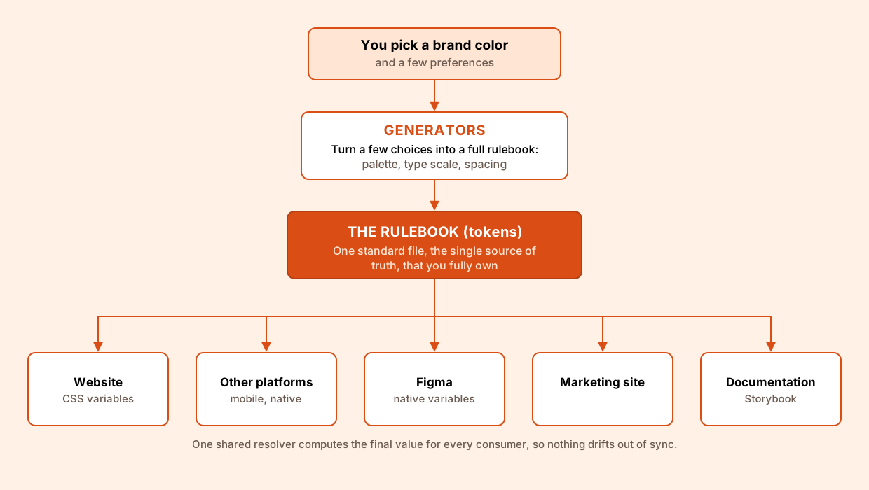
Because every layer reads from the same rulebook, customization happens in one place and flows everywhere. You can let the generators build a full system from a single brand color, or hand-author and import your own tokens and edit any value directly, since the output is plain, standard data with no lock-in. Themes, sub-brands, and light or dark modes are just different rulebooks, references resolve through one shared engine so nothing drifts, and the same tokens export to CSS, Figma, or any other platform. The result is deep customization at every level without ever trading away consistency.
The public front door, a marketing site that explains the system and routes people to the theme builder, the component library, the documentation, and the community.

UI Organized is free and open source, not a paywalled product with a thin free tier. The whole thing, the theme builder, the Figma plugins, and the token engine, is built in the open and self-hostable, so you own your data and never depend on a vendor's cloud. Contribution is open to both sides of the craft: designers can shape the presets, the Figma workflows, and the documentation, while developers can extend the generators, the resolver, and the platform exports. The harder and more interesting goal is designing for contributors and not just users, since an open-source project lives or dies on its contribution workflows, onboarding, and docs.
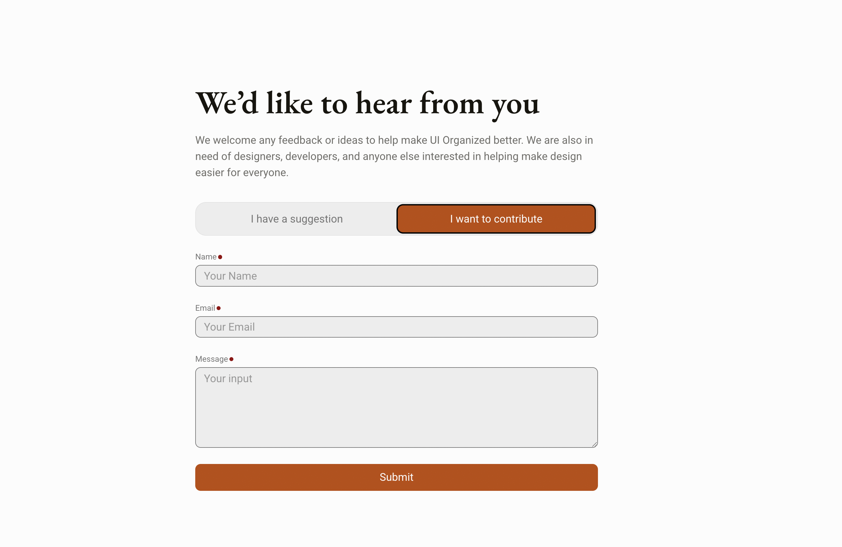
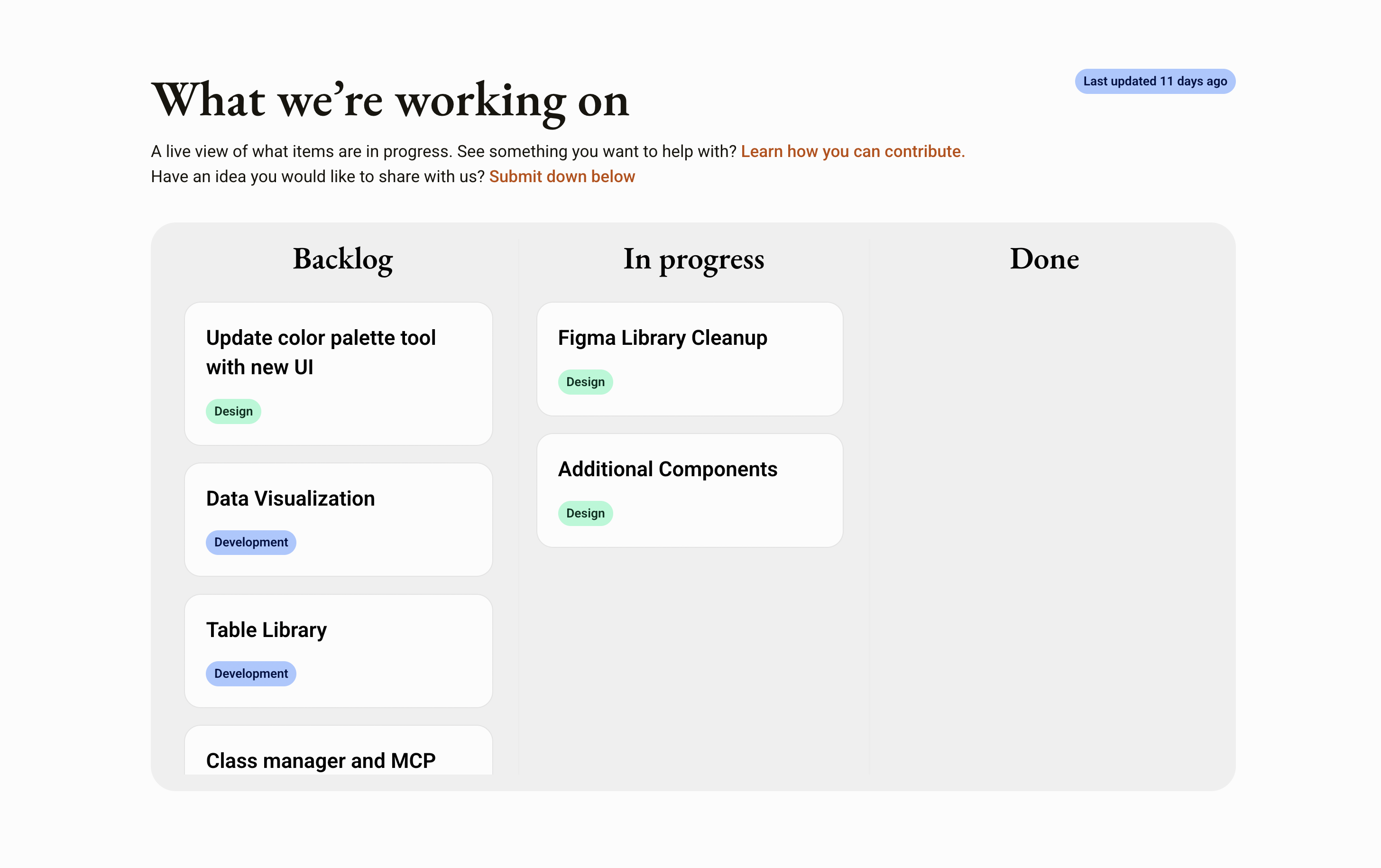
Anyone can pitch an idea straight from the site through a contribute form. Each submission is filed automatically as an entry on the project's GitHub board, and once work actually starts on an idea, the site's progress dashboard updates on its own to reflect it. That keeps the roadmap transparent, shows contributors where their idea stands, and makes the project's momentum and impact visible to everyone.
The published documentation reads from the same single source of truth as the website, Figma, and every other consumer, so the docs can't drift out of sync with what actually ships.

Pick a single brand color and the generator builds a complete, balanced palette, from light tints through dark shades, plus a matching type scale and spacing. It works in OKLCH, a perceptual color space where equal numerical steps read as equal steps to the eye, so lightness and chroma stay even across the whole ramp instead of the muddy mid-tones and washed-out ends you get when you interpolate in plain RGB or HSL. The output is plain, standard tokens you fully own, with no lock-in.

A companion Figma plugin closes the loop on the design side. It reads the same palette and writes it into a file as native Figma variables, creating them on the first run and updating the ones it already made on later runs, then drops a set of labeled swatches onto the canvas so designers can see and pull from the exact values developers ship.

A theme is a full set of design tokens that defines one look. Themes import from Tokens Studio or plain DTCG files and export straight to CSS, or to Figma as native variables, where the export updates what it already created instead of making duplicates.

Outline icons look spindly when shrunk and clumsy when enlarged. As an icon changes size, the system tunes its stroke weight so it stays optically balanced at every size, without anyone hand-tuning anything. The weight follows a power curve rather than scaling one-to-one with the icon, so it grows and shrinks more slowly than the artwork itself: a 24px icon holds the reference stroke of 2.0, a 12px icon eases down to about 1.4, and a 64px icon rises to roughly 3.3. It only touches outline icons, since solid, filled shapes do not have the same optical problem and are left alone.

I work on design systems professionally, but only on the design side. UI Organized is a chance to own the entire loop solo, defining tokens, authoring the Figma source, publishing the code library, and building the tooling that keeps those layers in sync. Alongside that, it's an exercise in building a community: open source lives or dies on contribution workflows, documentation, and onboarding, so I want to learn to design for contributors, not just users. Underneath both is the meta-layer I care about most, designing the systems and tools that shape how everyone else designs.